Moțochine
Bucharest, 2019
Team
Branding:Paul Vârlan
Category
Horeca
Surface
17 m2
Status
Project


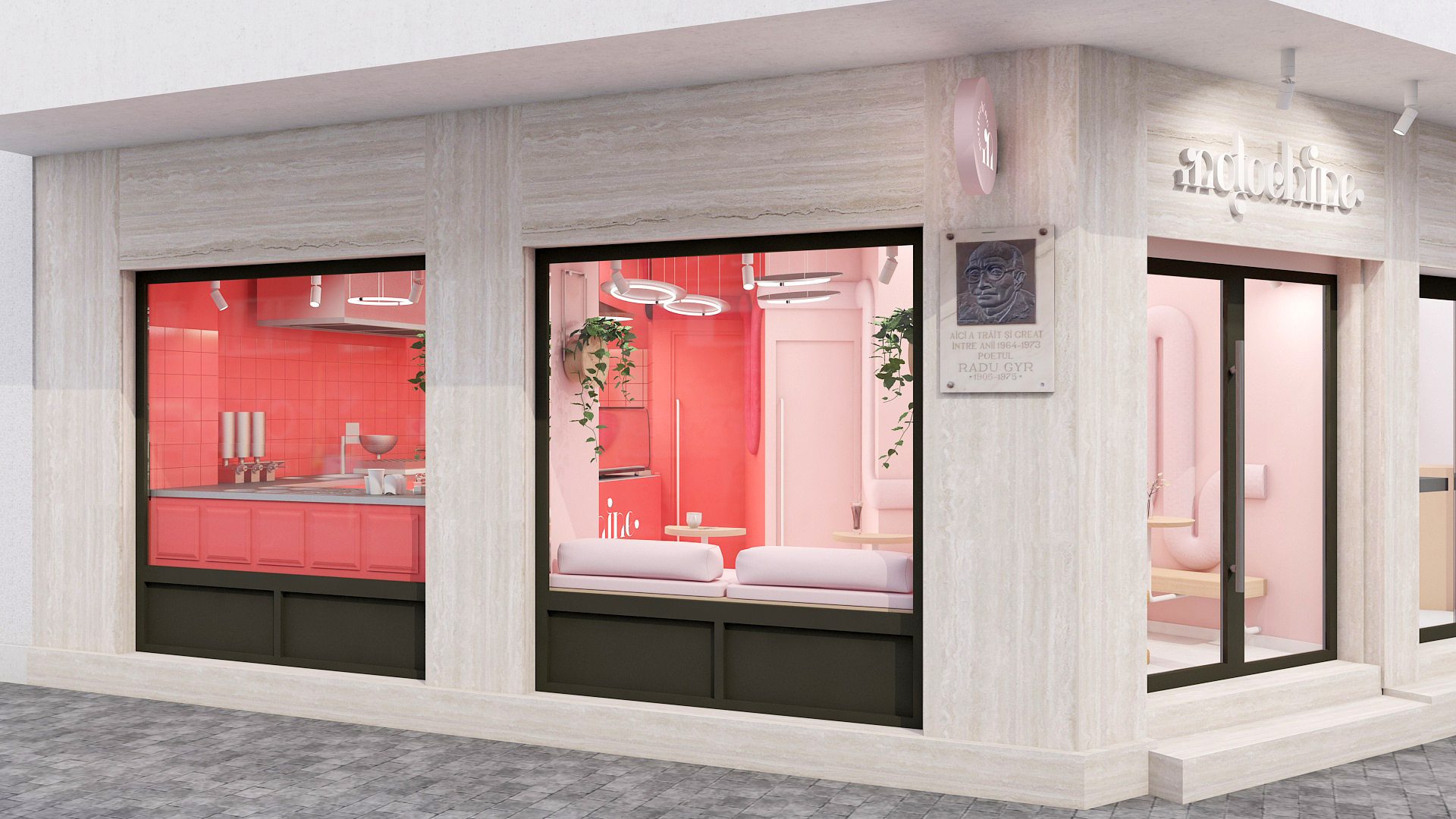
The interior design concept was coagulated around the branding project imagined by Paul Vârlan, graphic designer, following the use of circular shapes and the predominance of pink and red colors in the composition of the logo. The narrow interior space, with an irregular contour, has been treated from a chromatic, dual point of view: the first area containing the entry and the customer service, with washable pink painted walls, including the basement access door and the three-dimensional ribbon that crosses the walls like meanders, from the right side, at the entrance to the back of the shop; the second area (preparation and customer interface), without physical delimitation from the first, was finished predominantly in red (counter, work furniture, walls, ceramic tiles). The juxtaposition of the two chromatics, one intense and one light, creates the premises of a harsh but "hype" contrast, like toppings in saturated colors, added to donuts and defines the functional zoning of the space.


The
horizontal planes - the floor made of semi-glossy cement screed, respectively
the structural ceiling, made of raw concrete - with shades of gray soften the
pink and red of the vertical elements.
Apparent installations (electrical, ventilation, detection) mounted on the ceiling, in the context of stainless inserts on the countertops and preparation equipment, give an industrial touch to the overall ambience that recalls the pop-art chromatic vibrations of the 50s.
The fully custom-designed furniture is subordinated to the color scheme and composed of solid wood (table tops), electrostatically painted steel (mobile table legs), painted MDF (counter and fronts), stainless steel (countertops), textiles (sinuous ribbon with partial backrest role).
 The
proposed lighting scheme contains customized fixtures (pendulums with stainless
steel discs and circular LED tubes), ready-made pendants above the counter and
applied, adjustable projectors, with dimmable LED source, with focus on the
walls and showcases, LED strip at the counter’s plinth level.


